

Challenge 01
Turning an offline sales journey into an AI-assisted online experience
How might AI narrow complex choices without removing the human support users trust?
Role
Product Designer
Scope
Web, mobile, design system, AI workflow
Status
LiveOutcome
Clearer journeys and stronger brand consistency
I worked across Affina's digital ecosystem, simplifying insurance journeys, evolving an existing design system toward a more healthcare-oriented experience, refining interfaces beyond handoff, and keeping the product language consistent across digital touchpoints.


Challenge 01
How might AI narrow complex choices without removing the human support users trust?
Challenge 02
How could one shared system make Affina clearer, warmer and easier to scale?
Challenge 03
How could the brand feel more relevant to women while staying youthful and energetic?
Business context
Affina wanted to move more of its insurance journey online.
Our solution
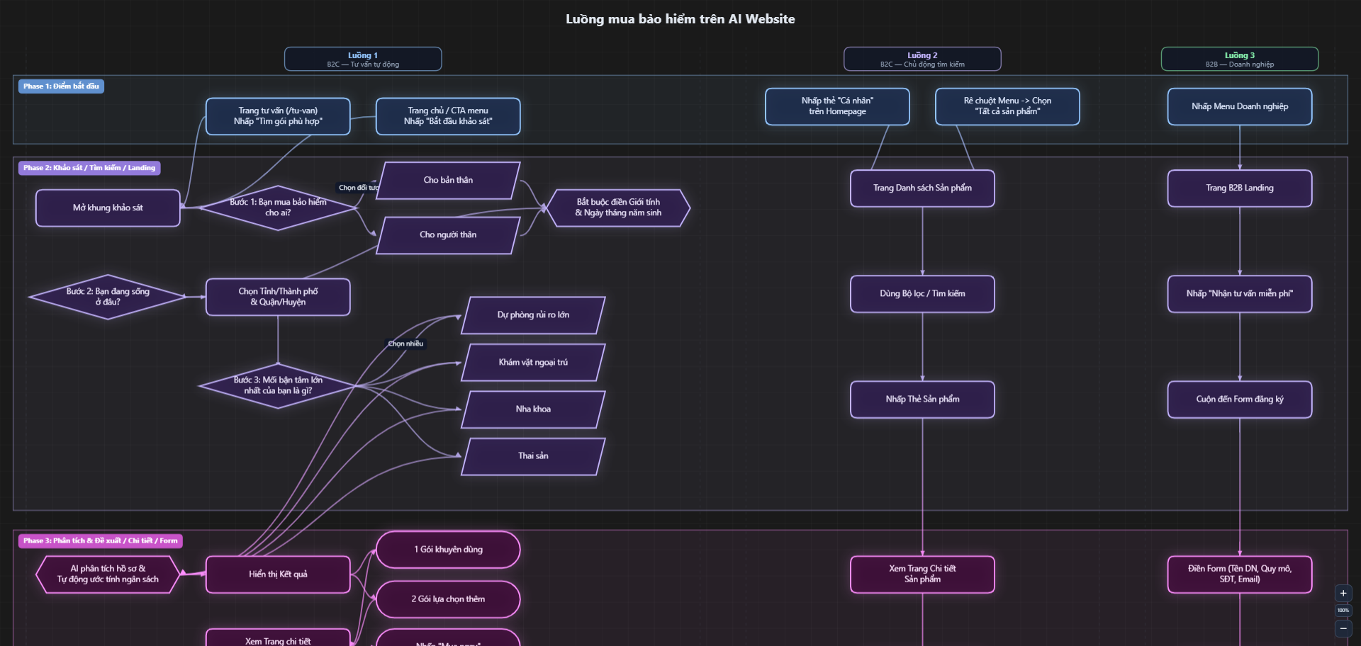
Instead of simply digitising the sales form, we built an AI-assisted journey that narrowed choices, recommended suitable plans, and made comparison easier.
My product design scope
I owned the journey from flow definition to responsive UI delivery.
How I solved it
Start with less friction
Open the survey from the homepage in a modal — no page change.
Ask only what shapes the match:
Coverage → Profile → Budget → Benefits → Insurer

01 · Insurance type
Choose the insurance product to explore.

02 · Insured person
Define who needs coverage and their date of birth.

03 · Budget & core benefits
Set an expected budget and the most important coverage.

04 · Preferences
Add optional benefits and preferred insurers.

05 · Matching
Process the answers before showing suitable plans.
Make the best options easy to scan
Surface three best-fit plans with essential details upfront.

06 · Recommendations
Surface three suitable plans with clear price and benefit cues.
Make complex benefits easier to compare across web and mobile

07 · Compare overview
Compare plan pricing and providers side by side.

08 · Benefit details
Review coverage differences before making a final choice.
Mobile comparison flow
Keep details readable, then use the expand control to see the full comparison.
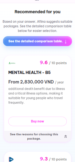
01 · Recommend
Keep the best-fit plan and essential facts easy to scan.
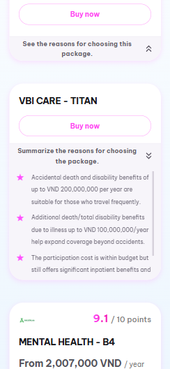
02 · Reveal reasons
Expand why a plan fits only when users need the detail.
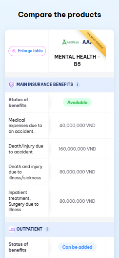
03 · Compare
Preserve readable rows within the narrow mobile viewport.
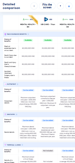
04 · Open overview
Fit the full table on screen for a faster overall comparison.

Measured behavior
Traffic during this period was primarily organic and internal testing, with no paid acquisition campaigns.
1,567
Users
2,046
Sessions
3,078
Page views
29
Leads
1.42%
Lead conversion
61.4%
of sessions that reached recommendations continued to Buy Now.
What's next
I treated the system as a product: start with the decisions it must protect, translate them into rules, then prove those rules through real interfaces.
System architecture
01
Clear decisions · Human care · Scalable delivery
02
Tokens · Grid · Accessibility · Responsive behavior
03
Foundations · Components · Patterns · Templates
Build order
01
Inventory live screens, repeated patterns and visual inconsistencies.
02
Set the shared language for color, type, spacing, grid, radius and elevation.
03
Build from small controls to reusable product patterns, with states and variants.
04
Document usage, map values to code and record every system change.
Design System 1.0

01 · Foundation
Brand & neutral colors
Spacing
Radius
02 · Atoms
Buttons
Default, hover, pressed and disabled variants are documented before components enter product flows.
From system to product
I defined primitive palettes, typography, spacing, radius and effects before composing product screens.

I mapped primitives to product roles such as primary, secondary, positive, warning and disabled.

Exported shared values as CSS custom properties so design decisions could move into implementation without translation gaps.

Applied the same tokens and reusable components across responsive healthcare journeys, then refined the system from real use cases.

01
Start from Home
Tap Remote Health Consultation.

02
Choose a provider
Pick the care partner that fits the need.

03
Review the service
Keep provider and benefit context together.

04
Accept the terms
Make the required consent easy to scan.
Turning customer insight into a brand system
Affina's customer data showed a strong female audience, especially among younger health customers and young parents. The brand needed to feel more relevant to women without losing its youthful, energetic character.
Founder direction → solution
The founder wanted the brand to feel more relevant to women without losing its youthful, energetic character. I translated that direction into a visual foundation that could scale across product and communication.

Next project
Designed a scalable purchase flow for partners, translating complex insurance rules into clearer UI, states, and handoff logic.

2026
Mobile reward experience for 4Oranges — the company behind MYKOLOR, SPEC, SONBOSS, EXPO, OEXPO, and SUPORSEAL.

May 2025
From fearing AI to designing for it.
Excited to collaborate! Email me at phuongthuy101222@gmail.com or DM me on Linkedin