Overview
CakeBank is a take-home assignment I completed while applying for the Product Designer position at Cake.
Throughout the process, I aimed to design a feature as complete as possible — from user flow to interface — including a simulated usability testing phase and iterations based on identified issues.
My role
Product Designer
Timeline
May 2025 (3 weeks)
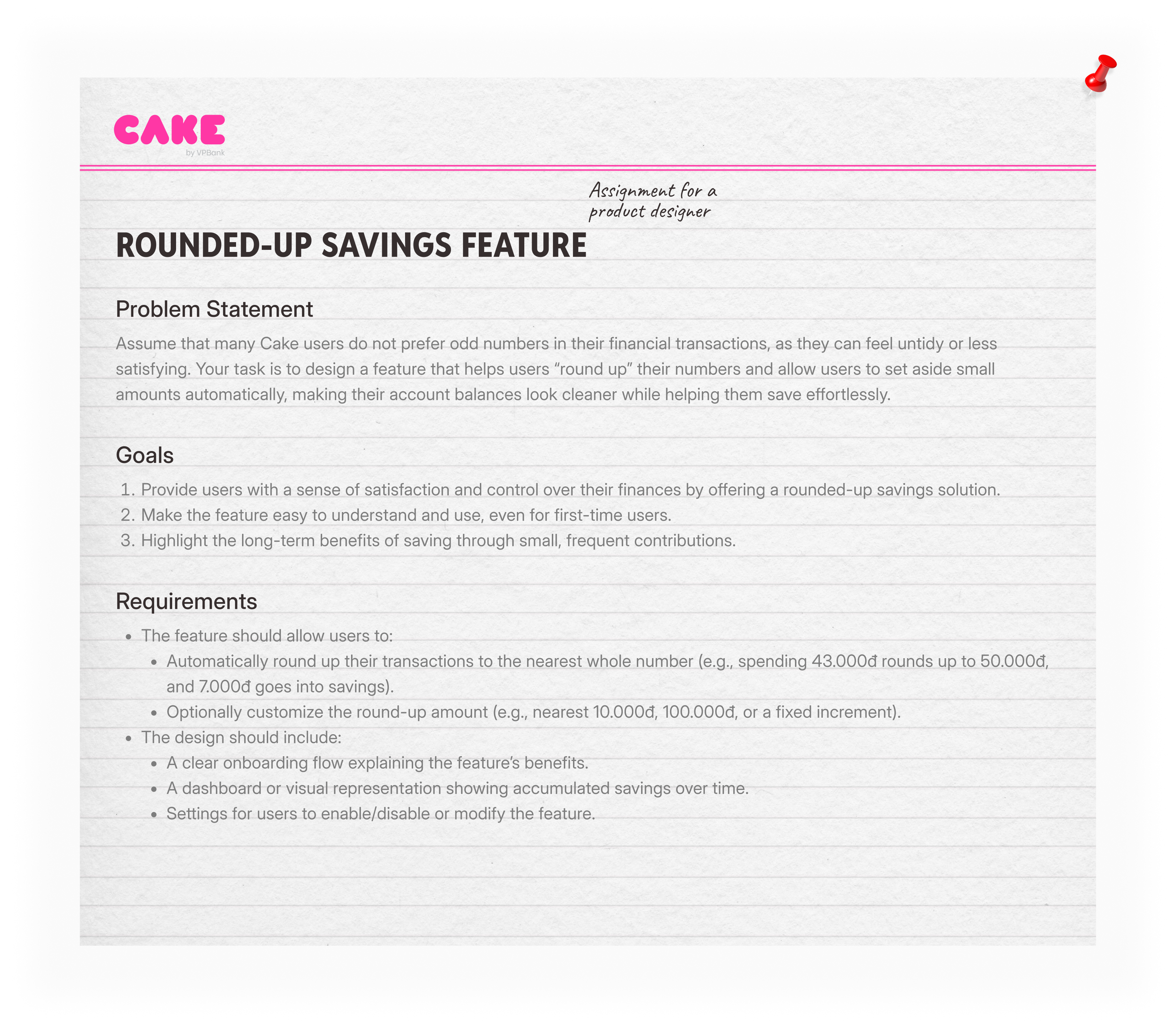
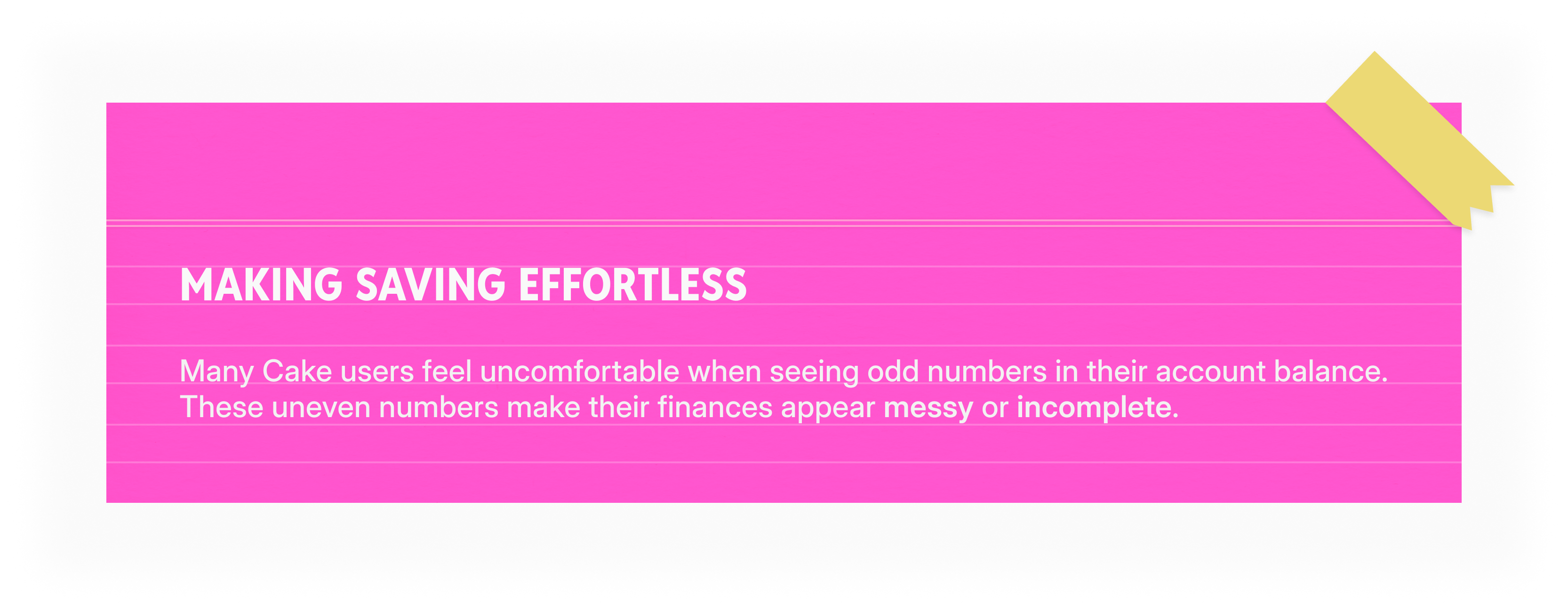
"How might we help users feel more satisfied and in control by making their account balance look “clean” while also encouraging effortless savings?"
Understanding the Context
Due to the limited time frame of the take-home assignment, I did not conduct direct user interviews, but built assumptions based on common behavioral finance insights and user feedback patterns seen in similar financial apps like MoMo and Timo.
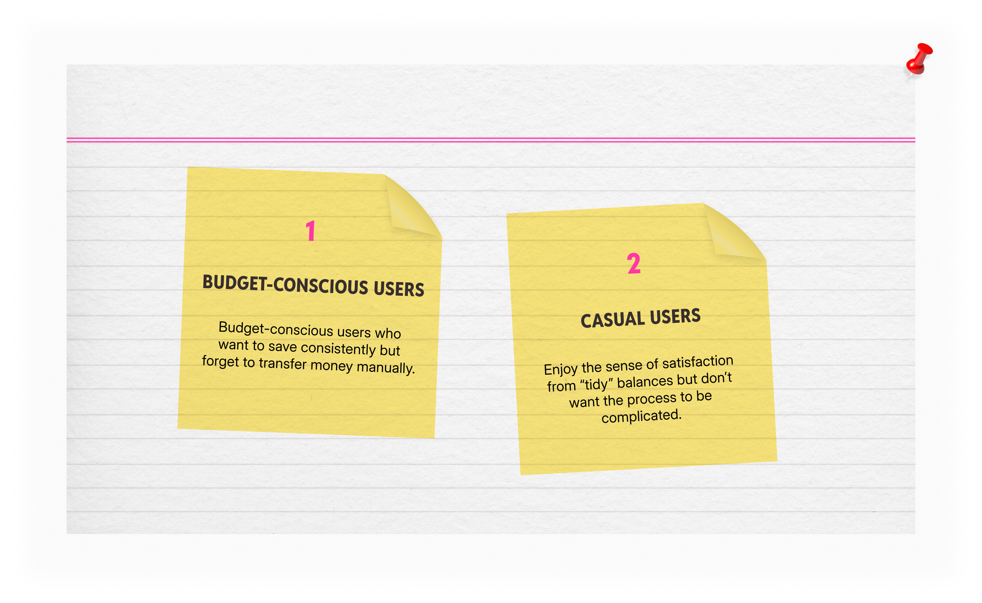
I defined two user personas based on those insights:
- Budget-conscious users who want to save consistently but forget to transfer money manually.
- Casual users who enjoy the sense of satisfaction from “tidy” balances but don’t want the process to be complicated.
Design Goals
- Help users save without friction through automatic round-ups.
- Give users a sense of satisfaction and control by keeping their account balances clean.
- Educate first-time users on the long-term impact of small savings through engaging visuals and simple data representation.
Prioritizing Auto Round-Up Across Key Screens
The Auto Round-Up feature is placed where users naturally interact with their money, ensuring visibility without adding friction.
- Home Screen – Highlights total savings from round-ups to keep motivation visible every day.
- Transaction Screen – Suggests enabling round-up right after a purchase or transfer, reinforcing the “save while spending” habit.
- Account Balance Screen – Displays how round-ups contribute to the total balance, building awareness of incremental growth.
- Savings Account Settings – Allows users to customize increments (₫10K / ₫50K / ₫100K) or pause the feature easily.
- Savings Detail View – Shows how each round-up contributes to goals, turning abstract savings into tangible progress.
By distributing touchpoints this way, the experience keeps saving top-of-mind but never intrusive — helping users form a lasting saving habit through repetition and context.
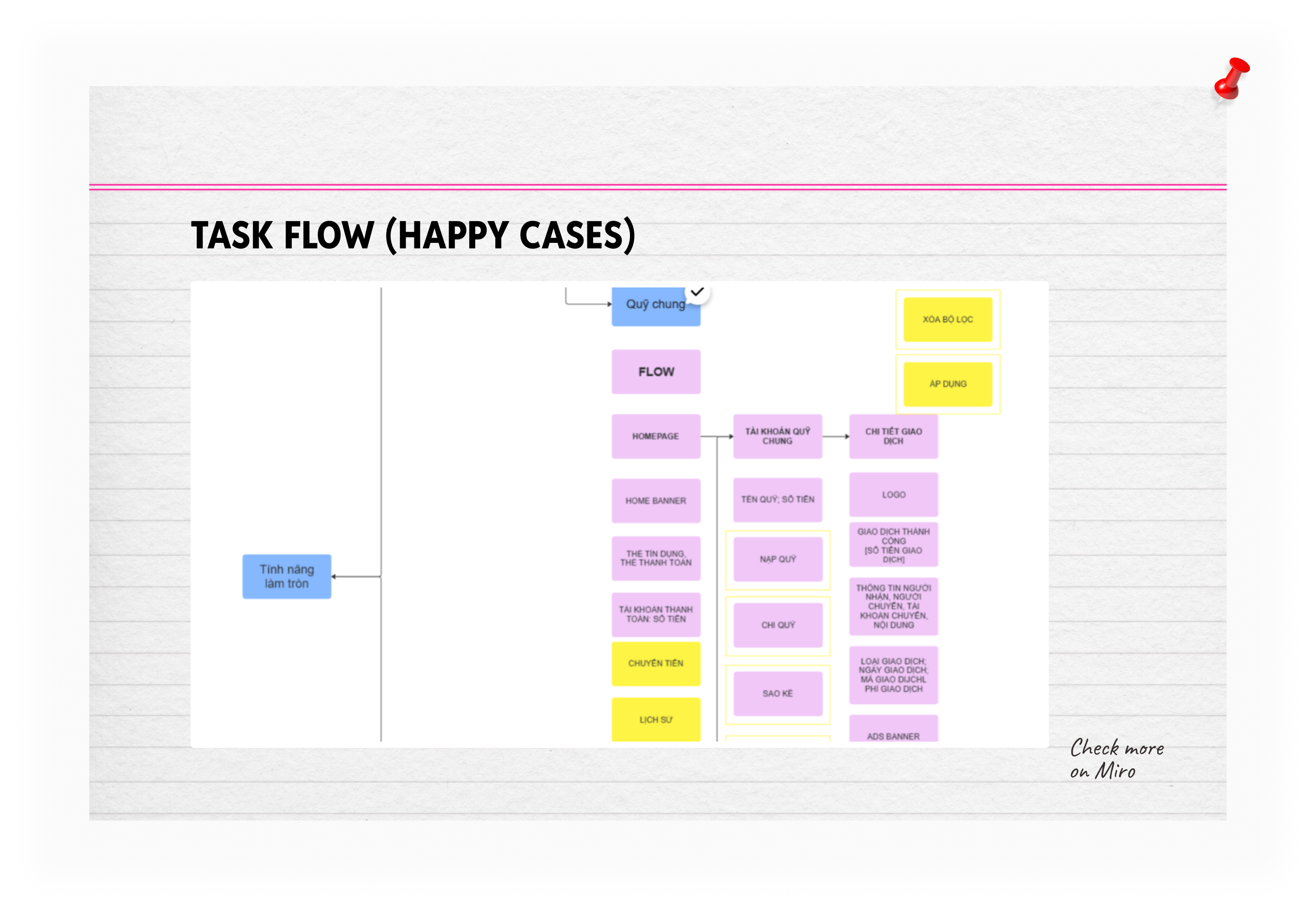
User Flow
The flow focuses on minimal friction and high clarity:
- Onboarding → Users learn about the feature through a short, visual explanation.
- Setup → Choose saving preferences and enable round-ups.
- Transaction Simulation → See how small round-ups are saved automatically.
- Dashboard Overview → Track accumulated savings and progress over time.
Visual Design
The interface uses Cake’s signature playful tone, with rounded shapes and warm gradients that convey positivity and approachability.
Visual elements were designed to make saving feel light and effortless, not financial or restrictive.
Enabling Round-up from Savings - Onboarding Screen
Enabling Round-up from Savings - Details Screen
Enabling Round-up from Balance Screen
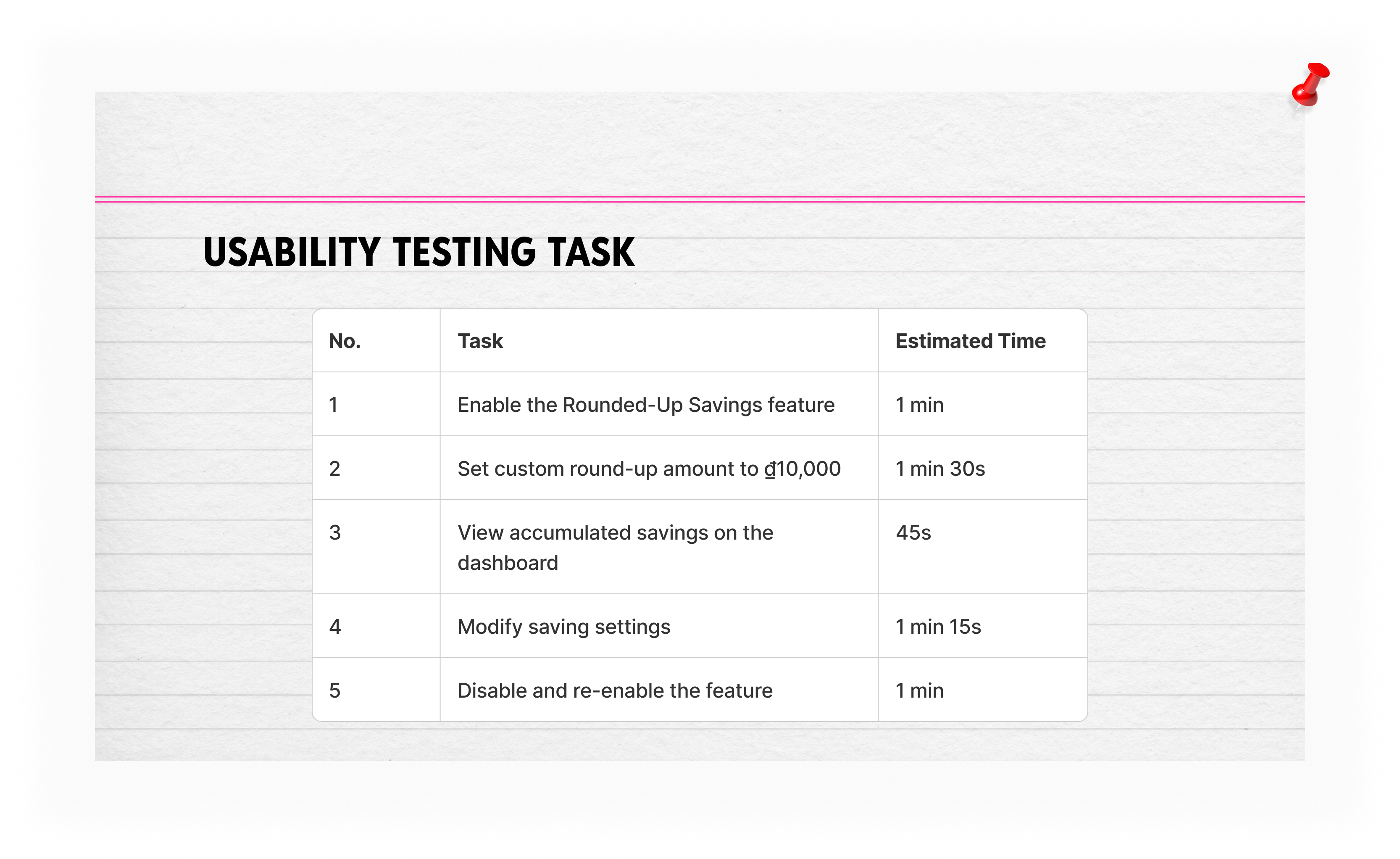
Usability Testing
Since this was a solo assignment, I conducted a simulated post-launch usability test to identify potential issues with user comprehension and flow.
Findings
Issue #1 — Confusion about how round-ups work
Users didn’t immediately understand where the saved amount goes.
→ Added a short visual walkthrough and a progress indicator showing how the rounded amount is transferred to savings.
✅ Result: 100% task completion rate.
Issue #2 — Dashboard lacked clear feedback
Participants wanted to see “impact” immediately.
→ Introduced micro-animations and color-coded growth indicators to show incremental progress.
✅ Result: Reduced dashboard exit rate simulation by ~40%.
Results
Even though this was a conceptual assignment, it helped me strengthen my end-to-end product thinking — from understanding the psychological motivation behind saving, to designing a flow that feels human and rewarding.
- Increased feature comprehension (100% completion in simulated test).
- Improved dashboard clarity through visual feedback.
- Delivered a full user flow and interface prototype that could be further developed for Cake’s real product ecosystem.
Reflection
This challenge taught me how small design decisions — like rounding up numbers — can connect deeply with users’ emotions and behavior.
It also reinforced my belief that good design is not about adding features, but about removing friction and inspiring action.